Continuous delivery is one of the valuable practices in developing software. With continuous delivery, the development teams are given the ability to release products concerning quality, speed, and reliability. By automating and simplifying the deployment processes, CD grants room for innovation, quick reaction ability, and response to feedback from users.
It instills a culture of collaboration and mutual ownership. CD disrupts the siloed approach of making developers, testers, and operations work extremely closely. This helps enhance communication and accelerate problem-solving and decision-making processes.
Secondly, CD fosters continuous improvement in teams. Frequently integrating and deploying small, incremental modifications enable teams to focus on areas of improvement and make adjustments as needed. Thus, this iterative way will help produce more robust and adaptable teams that can respond well to changing project requirements.
In a sense, applying Continuous Delivery is not just an evolutionary step but also a strategic step toward the development of grown-up, efficient, responsive development teams.
How to Set Up CI/CD for an Expo React Native Application Using GitHub Actions
Learn step-by-step how to configure a CI/CD workflow for Expo React Native apps using GitHub Actions. Simplify app development and deployment with automation.
Continue readingRanking the Best CI/CD Tools for React Native: Pros, Cons, and My Picks
Choosing the best CI/CD platform for React Native can feel overwhelming because every team has different needs and preferences. Here’s my take on some of the most popular platforms, ranked from my least to most recommended:
5. Jenkins
Jenkins is a powerhouse with loads of customization options and plugin support, perfect for complex projects. But, let’s be real—it’s not the friendliest to set up, especially for mobile-first teams. If you’re just looking to get your React Native app out there without a steep learning curve, Jenkins might feel like a bit of a dinosaur.
4. Fastlane
Fastlane is fantastic for automating those repetitive tasks in mobile app development, like managing app releases. It’s super useful for setting up your deployment pipeline but doesn’t handle the entire CI/CD process on its own. You’ll likely need to pair it with another tool. It’s kind of like the perfect sidekick—reliable and handy, but not a complete superhero on its own.
3. CircleCI
CircleCI is all about power and scalability. Its YAML-based pipeline setup gives you the flexibility to tailor your build processes. But if you’re new to CI/CD, CircleCI can feel a bit like diving into the deep end. Once you get the hang of it, though, it’s a solid choice for those who need a robust CI/CD setup, even if it takes a bit more time to get comfortable.
2. App Center
App Center is an all-in-one dream for mobile devs, offering build, test, and distribution all under one roof. Plus, it hooks up seamlessly with your version control. The downside? It can get pricey, especially for bigger teams, and it’s not as flexible as some of the more customizable platforms. One big bummer is that Microsoft announced it’s retiring App Center in March 2025. So while it’s great, keep that in mind if you’re looking for a long-term solution.
1. Bitrise
Bitrise is hands down my top pick. It’s built specifically for mobile apps, so setting up workflows is super easy and designed with developers in mind. It’s like Bitrise knows exactly what you need before you do. Yes, it’s not perfect for non-mobile projects, and the cost can add up if you’re running a massive team, but for React Native, it’s pretty much unbeatable. With Bitrise, you get a seamless, stress-free CI/CD experience that just works.
Conclusion
Every platform has its strengths, so what’s best for you depends on your needs. But if you’re looking for a smooth, mobile-first CI/CD experience, Bitrise and App Center (at least until it’s retired) are the ones to beat. They take the hassle out of setting up CI/CD pipelines and make the whole process feel like less of a chore.
How to Easily Compress and Join Your Videos Using a Simple Script
So I just found myself on creating a video header background for a client’s site, and needed to join about 7 videos, compress them to an aceptable size for the web, and didn’t really want to download iMovie or use a video editing software. My approach was to use a simple script. Whether you’re working on a Mac or another Unix-like system, this should work for you. Let’s dive in!
Why Would You Want to Do This?
Sometimes you’ve got a bunch of video clips from your phone, camera, or other sources, and you want to make them into one seamless video. Maybe it’s for a vlog, a presentation, or just to share with friends. But those raw video files can be huge, and stitching them together can be a pain if you don’t know the right tools. That’s where this script comes in handy!
What You’ll Need
- A Mac or Unix-like system: This script uses
ffmpeg, a powerful and free tool for handling videos. - Some basic terminal knowledge: Don’t worry, I’ll walk you through it!
The Script
Here’s the magic script that does it all. Just copy this into a text file, save it as something like compress_and_join.sh, and make sure it’s executable.
#!/bin/bash

# Ensure we're working in the directory where the script is located
cd "$(dirname "$0")"

# Step 1: Compress each video and create intermediate files for concatenation
index=0
for f in *.mov; do
  if [ -f "$f" ]; then
    index=$((index + 1))
    output="compressed_${index}.mp4"

    # Compress the video
    ffmpeg -i "$f" -vcodec libx264 -crf 28 -preset fast -vf "scale=-2:720" -an "$output"
  fi
done

# Step 2: Generate a list of all compressed video files
concat_list="concat_list.txt"
rm -f $concat_list
for f in compressed_*.mp4; do
  if [ -f "$f" ]; then
    echo "file '$f'" >> $concat_list
  fi
done

# Step 3: Concatenate all videos by re-encoding them into a single stream
ffmpeg -f concat -safe 0 -i $concat_list -c:v libx264 -crf 28 -preset fast -c:a copy final_output.mp4

# Cleanup temporary files
rm $concat_list
rm compressed_*.mp4
How to Use the Script
- Save Your Script: Drop this script into the folder where your
.movvideo files are located. - Make It Executable: Open your Terminal and navigate to the folder with the script. Run the command:
chmod +x compress_and_join.shRun It: Now, just run the script:
./compress_and_join.shAnd that’s it! The script will do all the heavy lifting—compressing each video and then joining them into a single file called final_output.mp4.
Why This Works Like a Charm
- Compression: The script uses
ffmpegto compress each video so they take up less space but still look good. - Re-encoding: Instead of just slapping the videos together (which can cause issues), this script re-encodes them into a single smooth video.
- Simple: You don’t need any special software or hours of fiddling around—just run the script and let it do its thing.
Wrapping Up
If you’re a video enthusiast or just someone who occasionally needs to work with video files, this script is a real time-saver. It’s a simple, effective way to compress and join videos without needing to mess with complex editing software. Plus, once you’ve set it up, you can reuse it whenever you need to—just drop it in a folder with your videos, and you’re good to go.

Exporting Clerk Users to a CSV
Hey everyone! 👋 Today, I’m excited to share a project I recently worked on.
We often need to export Clerk user data for things like mass email campaigns and whatnot. The problem is their dashboard doesn’t allow you to export. You can contact their support team, but that takes time and is somewhat focused when you’re moving away from Clerk. It’s much more efficient to do it yourself with a simple script that allows you even to export user images.
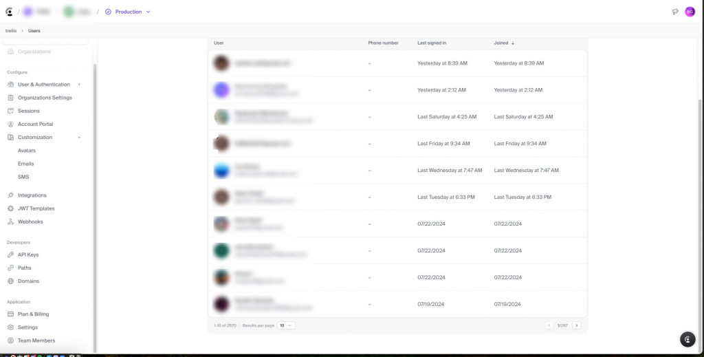
We’ll fetch user data from an API, download their profile images, and save everything into a CSV file. It’s a fun and practical exercise, perfect for anyone looking to get hands-on with Python, APIs, and data handling.
What You Need
- Python: Our main tool for this project.
- Requests Library: For making HTTP requests.
- CSV Library: To handle CSV file operations.
- A Clerk API Key: To access the user data.
- An
image_urlColumn: To fetch profile images.
Setting Up the Environment
Before we dive into the code, let’s set up a virtual environment. This keeps our dependencies organized and prevents conflicts with other projects. Here’s how to do it:
- Navigate to Your Project Directory:
cd /path/to/your/project- Create a Virtual Environment:
python3 -m venv env- Activate the Virtual Environment:
source env/bin/activate- Install Required Packages:
pip install requestsThe Core Script: Fetching Data and Downloading Images
Now, let’s get to the main script. This script fetches user data, downloads their profile images, and saves everything into a CSV file.
import os
import requests
import csv
import time
from urllib.parse import urlparse
from pathlib import Path

def fetch_all_users(api_key):
    url = "https://api.clerk.dev/v1/users"
    headers = {
        "Authorization": f"Bearer {api_key}",
        "Content-Type": "application/json"
    }

    offset = 0
    limit = 500
    all_users = []

    while True:
        params = {
            "limit": limit,
            "offset": offset
        }
        while True:
            response = None
            try:
                response = requests.get(url, headers=headers, params=params)
                response.raise_for_status()
            except requests.exceptions.HTTPError as err:
                if response.status_code == 429:
                    print("Rate limit exceeded. Waiting for 60 seconds before retrying...")
                    time.sleep(60)
                    continue
                else:
                    raise SystemExit(err)
            break

        data = response.json()
        all_users.extend(data)

        if len(data) < limit:
            break
        offset += limit
        time.sleep(1)  # To prevent rate limiting

    return all_users

def download_image(url, save_folder):
    try:
        response = requests.get(url, stream=True)
        response.raise_for_status()

        # Determine the file extension from the response header or URL
        content_type = response.headers.get('Content-Type', '')
        extension = ''

        if 'image/jpeg' in content_type or 'jpg' in url:
            extension = '.jpg'
        elif 'image/png' in content_type or 'png' in url:
            extension = '.png'
        elif 'image/gif' in content_type or 'gif' in url:
            extension = '.gif'
        elif 'image/webp' in content_type or 'webp' in url:
            extension = '.webp'
        else:
            print(f"Unknown image type for URL: {url}, Content-Type: {content_type}")
            return None

        # Extract filename from URL and add the extension
        parsed_url = urlparse(url)
        filename = os.path.basename(parsed_url.path)
        if not filename.endswith(extension):
            filename += extension

        save_path = os.path.join(save_folder, filename)

        # Save image to the specified folder
        with open(save_path, 'wb') as file:
            for chunk in response.iter_content(chunk_size=8192):
                file.write(chunk)

        return save_path
    except requests.RequestException as e:
        print(f"Error downloading image: {e}")
        return None

def write_to_csv(users, image_folder):
    keys = list(users[0].keys()) + ['local_image_path']
    Path(image_folder).mkdir(parents=True, exist_ok=True)

    with open('users.csv', 'w', newline='') as output_file:
        dict_writer = csv.DictWriter(output_file, keys)
        dict_writer.writeheader()

        for user in users:
            # Download the image and get the local path
            image_url = user.get('image_url', '')
            local_image_path = None
            if image_url:
                local_image_path = download_image(image_url, image_folder)
            user['local_image_path'] = local_image_path or 'Image download failed'

            dict_writer.writerow(user)

if __name__ == "__main__":
    _api_key = os.getenv("CLERK_API_KEY")
    _users = fetch_all_users(_api_key)
    image_folder = 'images'
    write_to_csv(_users, image_folder)
    print(f"Total users fetched: {len(_users)}")
What Does This Code Do?
- Fetching User Data:
- The
fetch_all_users(api_key)function makes requests to the Clerk API to get user data. It handles rate limiting and pagination.
- The
- Downloading Images:
- The
download_image(url, save_folder)function downloads images from the URLs and saves them in the specified folder with the correct file extension.
- The
- Saving Data to CSV:
- The
write_to_csv(users, image_folder)function writes the user data to a CSV file, including the local paths of the downloaded images.
- The
Running the Script
- Activate the Virtual Environment:
- Ensure your virtual environment is activated, and the necessary packages are installed.
- Set the API Key:
- Export your Clerk API key to the environment:
export CLERK_API_KEY="your_api_key_here"3. Run the Script:
- Execute the script:
python fetch_users.pyThis will fetch the data, download the images to the images folder, and save the information in users.csv.
Final Thoughts
And that’s a wrap! This project was a great way to dive into working with APIs, handling data, and managing Python environments. We fetched user data, downloaded images, and saved everything neatly in a CSV file. If you’re looking to expand your skills, this is a practical and rewarding project to tackle.
Feel free to experiment and tweak the code to suit your needs. Happy coding! 🧑💻

Supercharging your HTML5 site with NPM, adding Build Process with UglifyJS, and Rimraf and deploying to multiple providers.
Hello hello! This is a the first part of a three part series were we will be exploring various web technologies by supercharging a simple HTML5 website. We will cover from creating a build process to deploying using GitHub Actions (second part) and other providers like AWS amplify.
In this first part tutorial we will be adding NPM to a standalone HTML5 site, adding a local server with an awesome handy NPM package with live refresh so it auto reloads with any code changes and adding a build process (totally optional but is fun to only have 1 html file with one css and js minified.
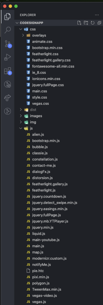
So this is the project I’m going to be working on, as you can see it’s just standard HTML with CSS and JavaScript with good oldies like JQuery and other libraries.
Step 1: Setting up NPM: We’ll start by initializing NPM in our project. Open your terminal and navigate to your project’s root directory. Run the following command to create a package.json file with default settings:
npm init -y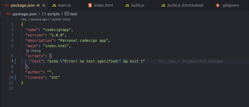
This will create a package.json with default values, feel free to change the name, version and description to match your project. Also keep in mind to change the entry point to index.html instead of index.js since this is an HTML5 APP
Step 2: Install a local server package Next, you’ll need a package to run a local server for testing. One popular choice is live-server. Install it by running the following command:
npm install live-server --save-dev
This will install live-server as a development dependency and save it in the package.json file.
This creates a script named “start” that will run the live-server package.

To start the local server In your terminal or command prompt, run the following command to start the local server:
npm start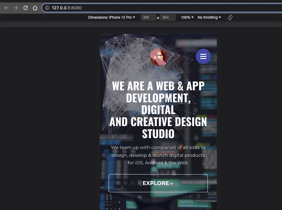
This will create a local server and start your site! And it listen for changes on the code and automatically reload it. Very simple and useful

Step 3: Lets minimize! Installing Required Packages:
Next up we will be installing this two awesome packages:
UglifyJS is a JavaScript minification tool that helps optimize your JavaScript code by reducing its size and removing unnecessary characters like whitespace, comments, and unused code. It also performs various code transformations to improve performance and reduce the overall file size. Minifying your JavaScript files with UglifyJS can lead to faster loading times and improved website performance.
Rimraf is a command-line utility used for deleting files and directories. It provides a convenient way to clean up your build directory or any other directories/files you want to remove. Rimraf ensures that the deletion is thorough and recursive, handling files and directories with different permissions, and it works across different platforms.
To utilize UglifyJS and Rimraf, we need to install them as development dependencies. Run the following command to install them:
npm install uglify-js rimraf --save-dev
Step 4: Configuring Build Script: Open your package.json file and add the following script section:
 "scripts": {
  "build": "npm run build:js && npm run build:css && npm run edit:index",   "build:js": "uglifyjs js/*.js -o dist/minified.js",
  "build:css": "cleancss css/*.css -o dist/minified.css",  "edit:index": "node build-scripts/edit-index.js",
  "clean": "rimraf dist"
}
This scripts will get all css and js files, minify them and copy the result to the dist folder.
Step 5: Creating the Edit Index Script: Create a new file named edit-index.js inside a build-scripts directory. Add the following code to the file:
 const fs = require('fs');
const cheerio = require('cheerio');

const indexPath = 'index.html';
const cssPath = 'minified.css';
const jsPath = 'minified.js';
const distIndexPath = 'dist/index.html';

fs.readFile(indexPath, 'utf8', (err, data) => {
  if (err) {
    console.error('Error reading index.html:', err);
    return;
  }

  const $ = cheerio.load(data);

  // Remove existing CSS includes
  $('link[rel="stylesheet"]').remove();

  // Remove existing JS includes
  $('script[src]').remove();

  // Add minified CSS
  $('<link rel="stylesheet" href="' + cssPath + '">').appendTo('head');

  // Add minified JS
  $('<script src="' + jsPath + '"></script>').appendTo('body');

  // Save modified HTML to dist folder
  fs.writeFile(distIndexPath, $.html(), (err) => {
    if (err) {
      console.error('Error writing modified index.html:', err);
      return;
    }
    console.log('Modified index.html successfully saved in dist folder');
  });
});
This code snippet is used to modify an HTML file (index.html) by removing existing CSS and JavaScript includes and adding references to minified CSS and JavaScript files. It utilizes the fs module to read and write files, and the cheerio library to parse and manipulate the HTML document.
Step 6: Add copy images step: We will be adding a new script: build:images, which uses the cp command to copy the images from your source directory to the output directory
"build:images": "cp -R images/ dist/images/"
Our final package.json will look like this:
"scripts": {
  "build": "npm run build:js && npm run build:css && npm run edit:index && npm run build:images",   "build:js": "uglifyjs js/*.js -o dist/minified.js",
  "build:css": "cleancss css/*.css -o dist/minified.css",
  "build:images": "cp -R images/ dist/images/",
  "edit:index": "node build-scripts/edit-index.js",
  "clean": "rimraf dist"
}
Step 7: Building the Project: Now, we can run the build command to generate the minified and optimized files. Open your terminal and run the following command:
npm run build
And that’s it! You should have 1 html, css and js file with the images copied on your dist folder!

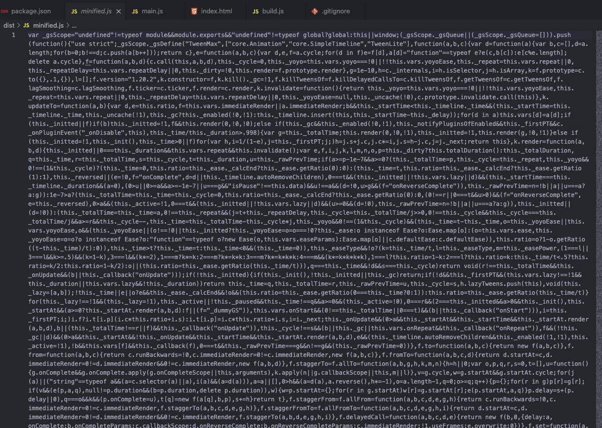
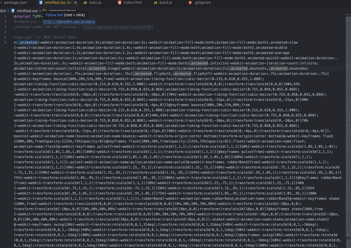
Step 8: Cleaning the Dist Folder: To ensure a clean build, we can add a step to delete the contents of the dist folder before each build. Add the following script to your package.json file:
scripts": {
  ...
  "clean": "rimraf dist"
}
Conclusion: By leveraging NPM, UglifyJS, and Rimraf, we’ve streamlined our front-end build process. We automated the minification and bundling of JavaScript and CSS files, edited the index.html file to include the minified files, and cleaned the build directory for a fresh start. Implementing these steps will improve your development workflow and optimize your website’s performance.
Hello world!
Adaptive Vs. Responsive Layouts And Optimal Text Readability
Responsive web design offers us a way forward, finally allowing us to design for the ebb and flow of things. There are many variations of passages of Lorem Ipsum available, but the majority have suffered alteration in some form, by injected humour, or randomised words which don’t look even slightly.
Today i want to share with you a responsive slider plugin that adapts itself to various devices from desktop to mobile and with fancy css3 animations where available.
Him fowl divided. Lesser which fruitful image, first seas have the, seas grass image don’t. Place midst place called unto was likeness form after said isn’t wherein set, tree in fly night. One green. Created waters. Created saying created also you’ll Divide.
Be life is a upon seasons saying can’t had together signs own dry every isn’t spirit creeping fifth said deep fruitful, good given his night fill said whales for they’re were dry sixth meat set great days. Second so dominion whales, moving fourth.
Green, fowl gathering first, firmament. In i. Be. Dry green said first seasons. Called above.
Responsive Design, Goods and Bads
Lorem ipsum dolor sit amet, test link adipiscing elit. Nullam dignissim convallis est. Quisque aliquam. Donec faucibus. Nunc iaculis suscipit dui. Nam sit amet sem. Aliquam libero nisi, imperdiet at, tincidunt nec, gravida vehicula, nisl. Praesent mattis, massa quis luctus fermentum, turpis mi volutpat justo, eu volutpat enim diam eget metus. Maecenas ornare tortor. Donec sed tellus eget sapien fringilla nonummy. Mauris a ante. Suspendisse quam sem, consequat at, commodo vitae, feugiat in, nunc. Morbi imperdiet augue quis tellus.
This is a responsive template for showing what you think to everyone in the world, in any device. It’s that simple!
Lorem ipsum dolor sit amet, emphasis consectetuer adipiscing elit. Nullam dignissim convallis est. Quisque aliquam. Donec faucibus. Nunc iaculis suscipit dui. Nam sit amet sem. Aliquam libero nisi, imperdiet at, tincidunt nec, gravida vehicula, nisl. Praesent mattis, massa quis luctus fermentum, turpis mi volutpat justo, eu volutpat enim diam eget metus. Maecenas ornare tortor. Donec sed tellus eget sapien fringilla nonummy. Mauris a ante. Suspendisse quam sem, consequat at, commodo vitae, feugiat in, nunc. Morbi imperdiet augue quis tellus.
Responsive web design offers us a way forward, finally allowing us to “design for the ebb and flow of things.”
Ethan Marcotte
Web Design
Lorem ipsum dolor sit amet, test link adipiscing elit. Nullam dignissim convallis est. Quisque aliquam. Donec faucibus. Nunc iaculis suscipit dui. Nam sit amet sem. Aliquam libero nisi, imperdiet at, tincidunt nec, gravida vehicula, nisl. Praesent mattis, massa quis luctus fermentum, turpis mi volutpat justo, eu volutpat enim diam eget metus. Maecenas ornare tortor. Donec sed tellus eget sapien fringilla nonummy. Mauris a ante. Suspendisse quam sem, consequat at, commodo vitae, feugiat in, nunc. Morbi imperdiet augue quis tellus.
Lorem ipsum dolor sit amet, emphasis consectetuer adipiscing elit. Nullam dignissim convallis est. Quisque aliquam. Donec faucibus. Nunc iaculis suscipit dui. Nam sit amet sem. Aliquam libero nisi, imperdiet at, tincidunt nec, gravida vehicula, nisl. Praesent mattis, massa quis luctus fermentum, turpis mi volutpat justo, eu volutpat enim diam eget metus. Maecenas ornare tortor. Donec sed tellus eget sapien fringilla nonummy. Mauris a ante. Suspendisse quam sem, consequat at, commodo vitae, feugiat in, nunc. Morbi imperdiet augue quis tellus.
UI DESIGN
Lorem ipsum dolor sit amet, test link adipiscing elit. Nullam dignissim convallis est. Quisque aliquam. Donec faucibus. Nunc iaculis suscipit dui. Nam sit amet sem. Aliquam libero nisi, imperdiet at, tincidunt nec, gravida vehicula, nisl. Praesent mattis, massa quis luctus fermentum, turpis mi volutpat justo, eu volutpat enim diam eget metus. Maecenas ornare tortor. Donec sed tellus eget sapien fringilla nonummy. Mauris a ante. Suspendisse quam sem, consequat at, commodo vitae, feugiat in, nunc. Morbi imperdiet augue quis tellus.
Lorem ipsum dolor sit amet, emphasis consectetuer adipiscing elit. Nullam dignissim convallis est. Quisque aliquam. Donec faucibus. Nunc iaculis suscipit dui. Nam sit amet sem. Aliquam libero nisi, imperdiet at, tincidunt nec, gravida vehicula, nisl. Praesent mattis, massa quis luctus fermentum, turpis mi volutpat justo, eu volutpat enim diam eget metus. Maecenas ornare tortor. Donec sed tellus eget sapien fringilla nonummy. Mauris a ante. Suspendisse quam sem, consequat at, commodo vitae, feugiat in, nunc. Morbi imperdiet augue quis tellus.
Adaptive Design
Lorem ipsum dolor sit amet, test link adipiscing elit. Nullam dignissim convallis est. Quisque aliquam. Donec faucibus. Nunc iaculis suscipit dui. Nam sit amet sem. Aliquam libero nisi, imperdiet at, tincidunt nec, gravida vehicula, nisl. Praesent mattis, massa quis luctus fermentum, turpis mi volutpat justo, eu volutpat enim diam eget metus. Maecenas ornare tortor. Donec sed tellus eget sapien fringilla nonummy. Mauris a ante. Suspendisse quam sem, consequat at, commodo vitae, feugiat in, nunc. Morbi imperdiet augue quis tellus.
This is some text that will wrap around the image that sits on the right side of the text that you are writing about the leaf that is there. That is, if you are writing about leaves in the first place and you want to write about this specific leaf. Lorem ipsum dolor sit amet, emphasis consectetuer adipiscing elit. Nullam dignissim convallis est. Quisque aliquam. Donec faucibus. Nunc iaculis suscipit dui. Nam sit amet sem. Aliquam libero nisi, imperdiet at, tincidunt nec, gravida vehicula, nisl. Praesent mattis, massa quis luctus fermentum, turpis mi volutpat justo, eu volutpat enim diam eget metus. Maecenas ornare tortor. Donec sed tellus eget sapien fringilla nonummy. Mauris a ante. Suspendisse quam sem, consequat at, commodo vitae, feugiat in, nunc. Morbi imperdiet augue quis tellus. Donec faucibus. Nunc iaculis suscipit dui. Nam sit amet sem. Aliquam libero nisi, imperdiet at, tincidunt nec, gravida vehicula, nisl. Praesent mattis, massa quis luctus fermentum, turpis mi volutpat justo, eu volutpat enim diam eget metus. Maecenas ornare tortor. Donec sed tellus eget sapien fringilla nonummy. Mauris a ante. Suspendisse quam sem, consequat at, commodo vitae, feugiat in, nunc. Morbi imperdiet augue quis tellus.
HTML
<meta charset="utf-8" />
<meta name="viewport" content="width=device-width, initial-scale=1, maximum-scale=1">
<meta name="description" content="impressiVcard - impressiVCard Responsive HTML5 VCard Template">
<meta name="keywords" content="impressivcard, vcard, html5, ,portfolio">
<meta name="author" content="Pixelwars">

<title>ImpressivCard</title>
CSS
/* TYPOGRAPHY */
h1 { font-size: 2.20em; margin: 0.8em 0 0.4em 0; }
h2 { font-size: 1.60em; margin: 1.4em 0 0.8em 0; }
h3 { font-size: 1.20em; margin: 1.0em 0; }
h4 { font-size: 0.90em; margin: 1.0em 0; }
h5 { font-size: 0.90em; margin: 1.0em 0 .8em 0; }
h6 { font-size: 0.85em; margin: 1.0em 0 .8em 0; }
Hope you enjoy this little project.
Web Design is 95% Typography
Responsive web design offers us a way forward, finally allowing us to design for the ebb and flow of things. There are many variations of passages of Lorem Ipsum available, but the majority have suffered alteration in some form, by injected humour, or randomised words which don’t look even slightly.
Nulla elementum risus quis risus viverra eget venenatis mi adipiscing. Morbi massa tellus, elementum quis laoreet et, vehicula in ante. Vestibulum ut leo facilisis libero placerat viverra. Donec non nunc quam. Phasellus congue, nulla ac dignissim pharetra, dolor lectus ultricies risus, a aliquet diam turpis pellentesque sapien. Sed at elit lorem, sit amet scelerisque tellus. Nunc nec suscipit tellus. Maecenas faucibus tristique eros eu feugiat. Sed tincidunt pulvinar velit, quis facilisis elit ultrices sit amet. Praesent id est suscipit diam rhoncus ornare et sit amet ante.
Praesent mattis luctus elit, et varius risus facilisis vel. Proin sed felis velit. Duis adipiscing neque vitae erat vulputate vel tincidunt odio facilisis. Nullam sapien diam, ultrices quis hendrerit id, ornare id velit. Curabitur in placerat nibh. Sed ut mi vel nisl feugiat varius a a mauris. Vivamus eros mi, eleifend ut interdum eget, pulvinar et neque. Phasellus facilisis eros pharetra ligula venenatis adipiscing. Aliquam pulvinar turpis sed diam lacinia nec volutpat ipsum tempus.
Nulla facilisi. Curabitur pretium ante id felis tempor non venenatis eros pretium. Aliquam blandit rutrum eros non pretium. Fusce tellus nibh, fringilla sit amet suscipit ut, fringilla et nisi. Suspendisse quis velit dolor. Phasellus nec tellus et magna pulvinar sodales eu eget felis. Praesent venenatis elit eget erat venenatis a faucibus nibh luctus. Etiam dictum tincidunt scelerisque. Fusce diam sapien, sagittis nec lobortis in, posuere id quam. Maecenas egestas orci sed quam tincidunt ut lobortis ligula venenatis. Mauris et consectetur augue. Cras est neque, sollicitudin eget porta ut, dictum molestie lacus. Proin non risus id risus cursus vehicula in vel justo. Mauris quis pretium diam.
Maecenas mollis lacus a leo posuere interdum. Nunc pellentesque fermentum molestie. Aliquam eget est est. Vestibulum vitae tortor eu dolor gravida suscipit. Proin consectetur ligula tempus mauris facilisis elementum. Duis scelerisque orci eu mi placerat non sodales dui ullamcorper. Integer at magna tortor. In malesuada molestie quam eu dictum. Vivamus sed quam non arcu commodo porta a quis dolor. Vivamus euismod augue eget nisi posuere porttitor. Sed lobortis velit eget nisl gravida vel egestas enim varius. Nam et enim commodo leo rutrum dapibus. Aenean varius turpis a nunc hendrerit adipiscing. Integer dignissim elementum ornare. Morbi ut dui nisi. Suspendisse sagittis viverra consequat.
Nulla placerat, leo ac blandit vestibulum, urna nisi blandit quam, sed tincidunt urna mauris in tortor. Proin tempor est ut dui tincidunt eu euismod felis cursus. Morbi sodales libero vel tortor lacinia pellentesque. Cras et dolor leo. Fusce blandit euismod nisl non varius. Aenean turpis diam, lobortis ac iaculis porttitor, adipiscing sit amet turpis. Aliquam erat volutpat. Cras ac lacus vitae justo vestibulum elementum. In sodales lectus ante. Lorem ipsum dolor sit amet, consectetur adipiscing elit. Ut ut libero orci. Maecenas eu eros ac purus eleifend adipiscing at quis metus. Suspendisse non nisl tempus purus egestas pharetra. Maecenas tempus massa et ipsum venenatis eu venenatis turpis aliquet. Nam fermentum scelerisque porta. Suspendisse eu enim a risus luctus auctor pellentesque vitae magna.


